Shopping Basket
You have no items in your shopping basket.

Wishlist
Your wishlist is currently empty
The word harlequin, in the context of colour, describes something variegated — varied in hue, unpredictable in combination, resistant to being reduced to a single note. It was a deliberate choice of name for a brand founded in 1960 as a wallpaper company in Britain, one that from the start treated colour not as decoration but as the central subject of its work. Today Harlequin operates within the Sanderson Design Group alongside Morris & Co., Zoffany, Scion, and others — but its identity within that collective remains distinct: where Sanderson draws from nature and archive, and Zoffany from classical tradition, Harlequin is oriented toward expression, personality, and the emotional logic of how colour behaves in a room.
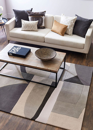
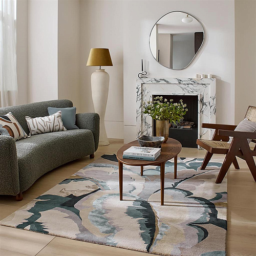
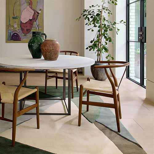
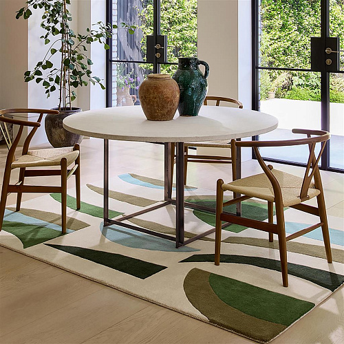
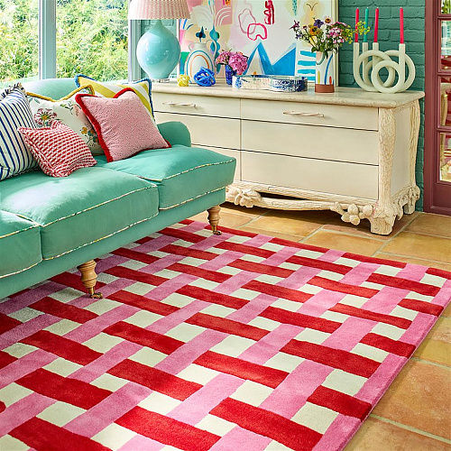
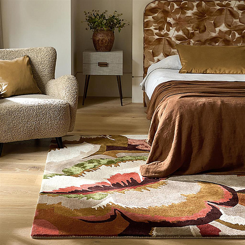
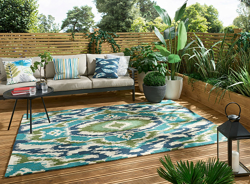
That orientation extended into rugs produced in partnership with Brink & Campman, the Dutch manufacturer in Lichtenvoorde whose technical range and design understanding make them the production partner of choice for several of the most design-serious rug brands on the market. The combination — Harlequin's colour-driven design studio and Brink & Campman's manufacturing precision — produces pieces that hold up both aesthetically and practically.
Harlequin commissioned a formal whitepaper from Professor Stephen Westland and researcher Soojin Lee exploring the relationship between colour choice, psychological wellbeing, and personal identity in interior spaces. This is not the kind of thing a brand does for show — it reflects how seriously the design team takes the question of why certain colour combinations feel right and others do not. The research feeds back into the collection development process, which is why the palettes in Harlequin's rug range tend to feel considered rather than arbitrary. The colours do not clash because they have been thought about in relation to each other from the beginning, not assembled from trend reports.
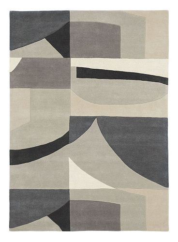
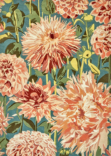
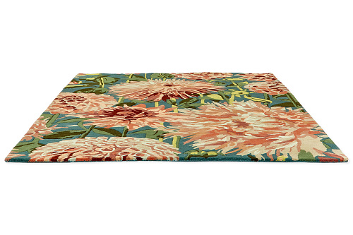
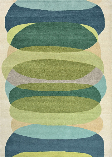
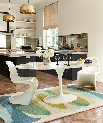
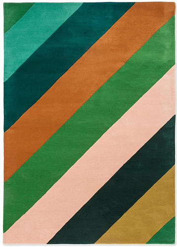
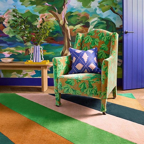
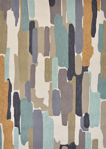
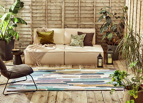
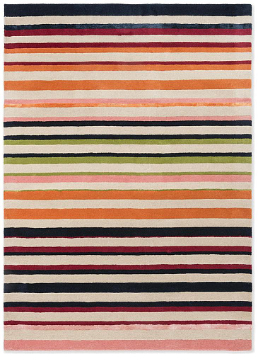
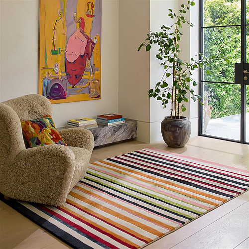
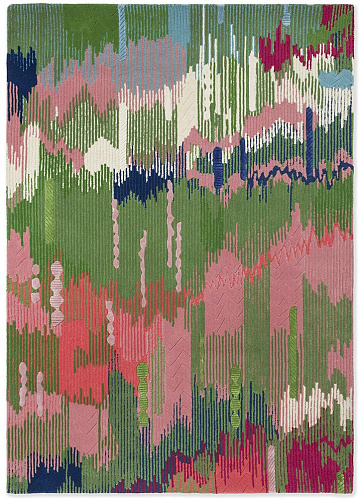
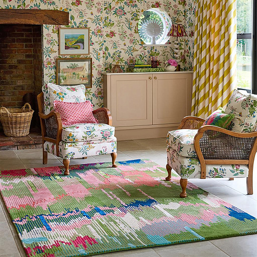
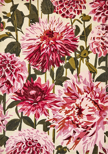
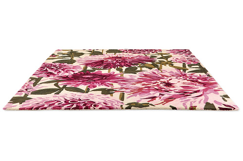
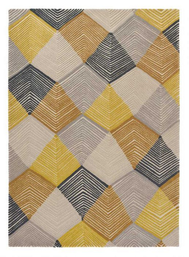
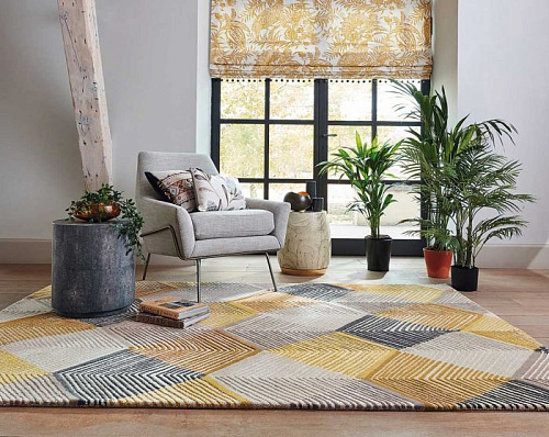
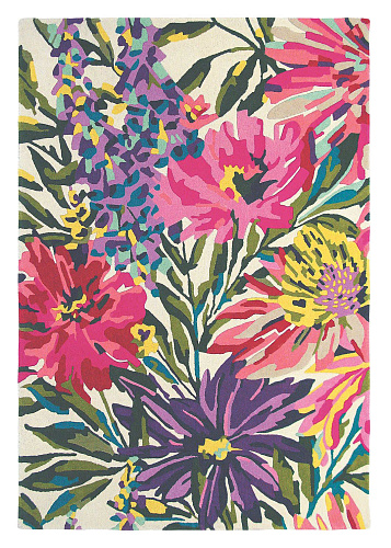
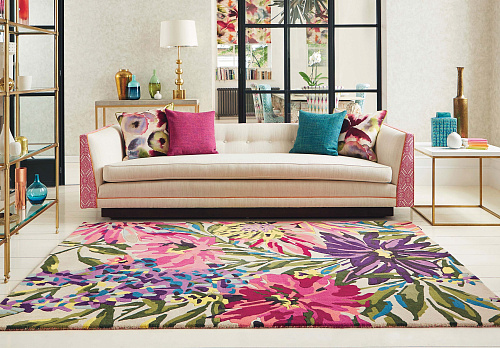
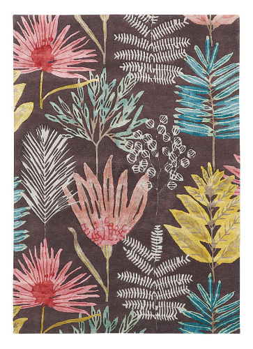
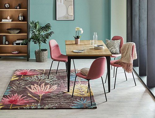
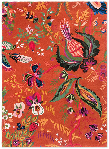
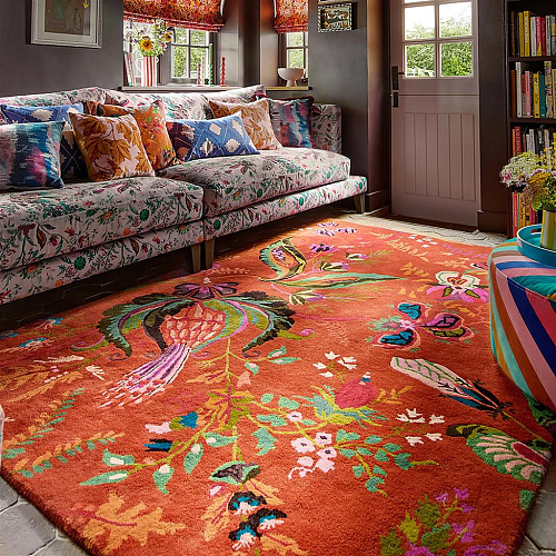
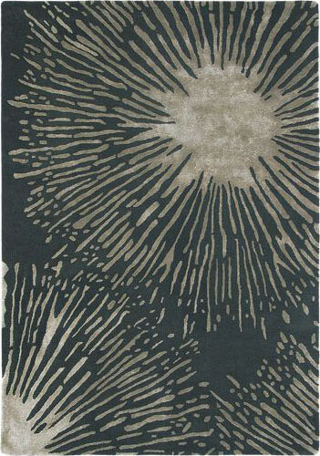
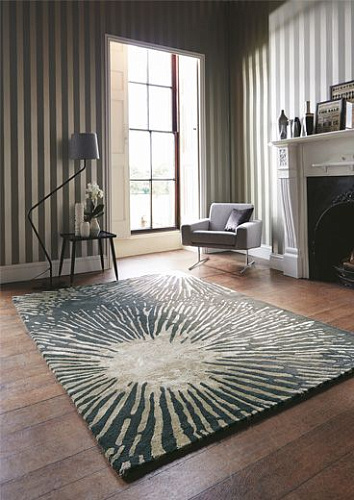
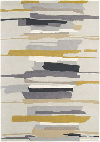
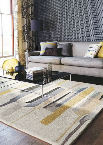
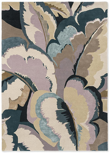
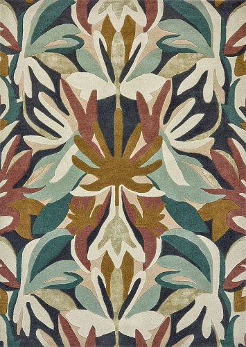
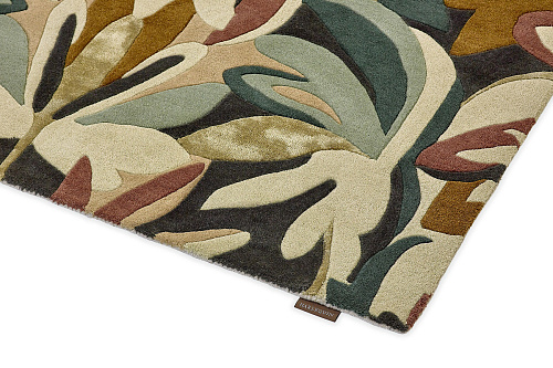
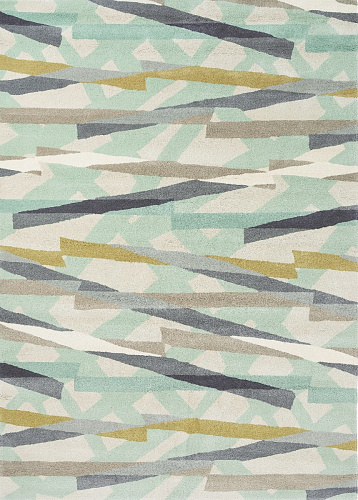
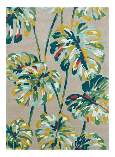
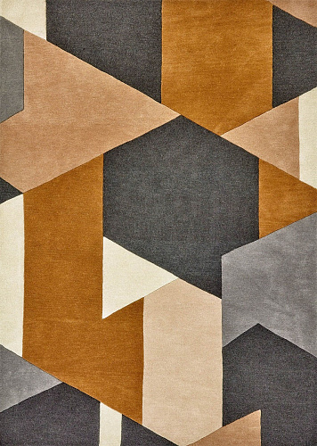
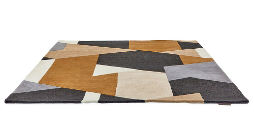
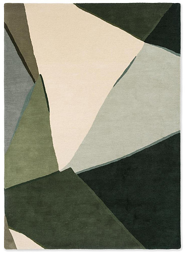
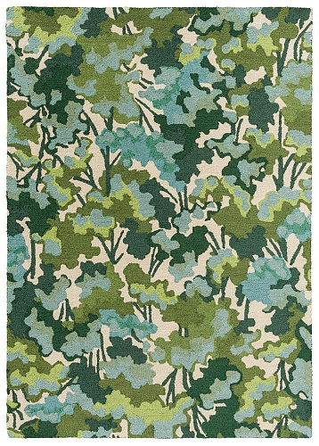
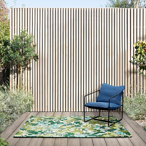
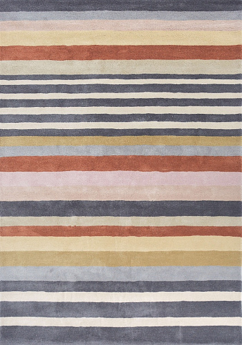
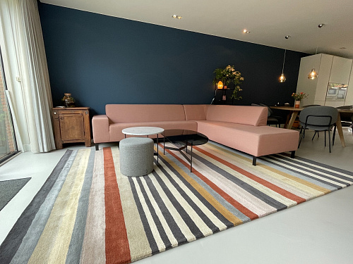
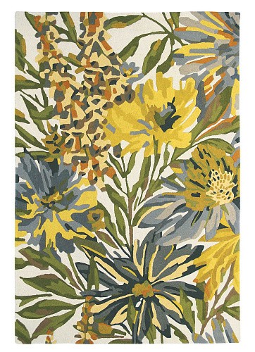
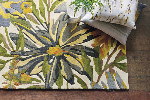
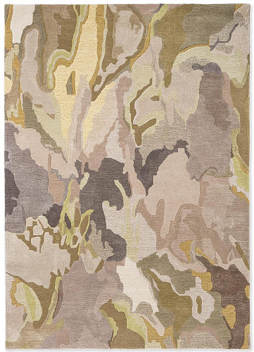
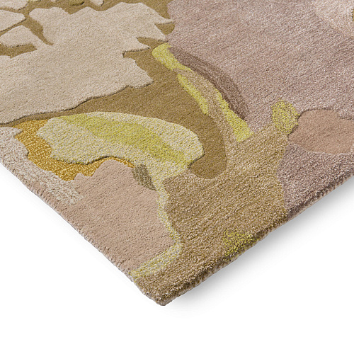
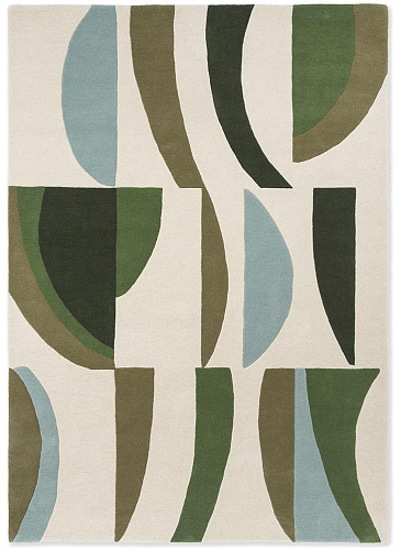
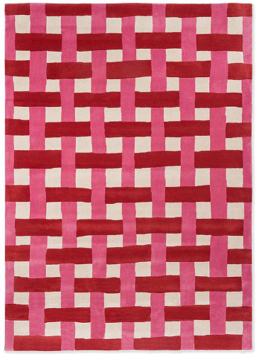
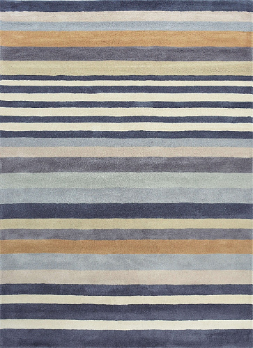
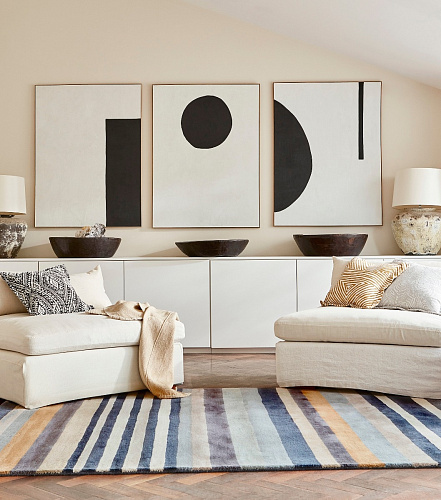
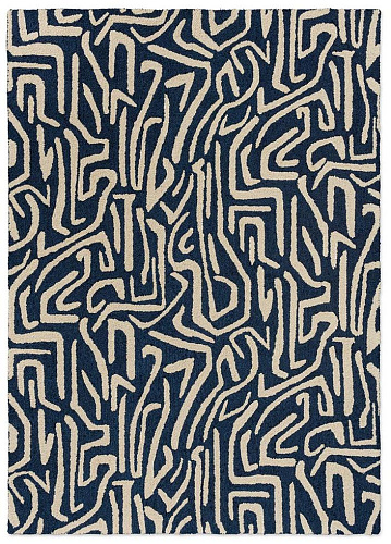
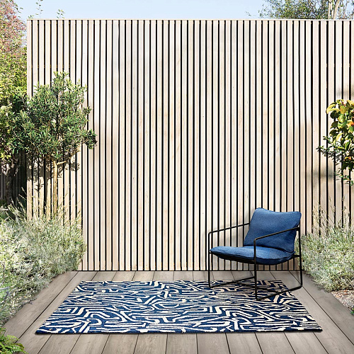
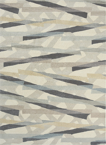
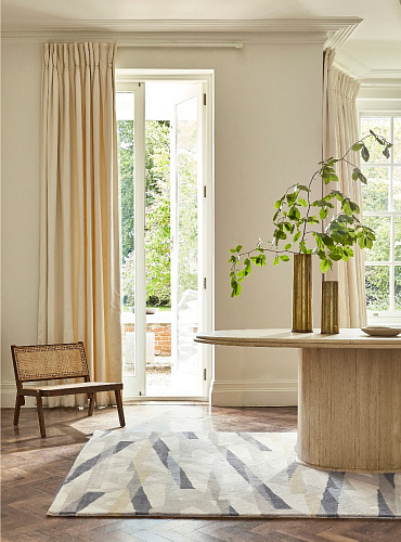
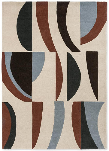
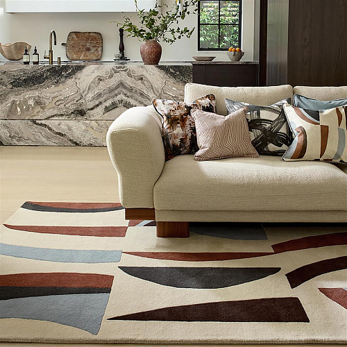
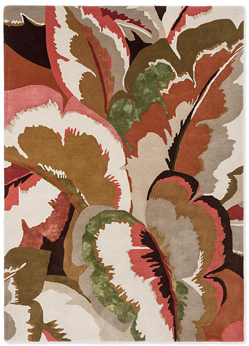
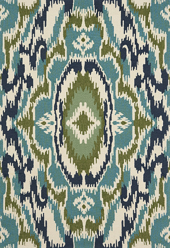
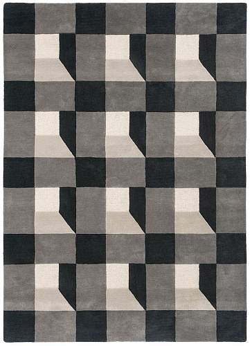
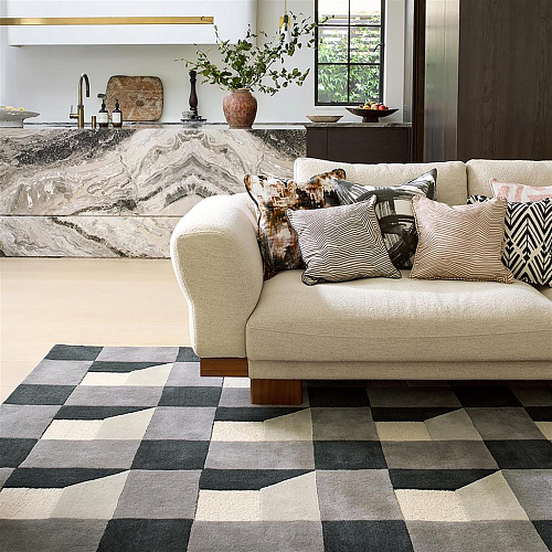
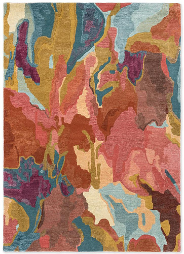
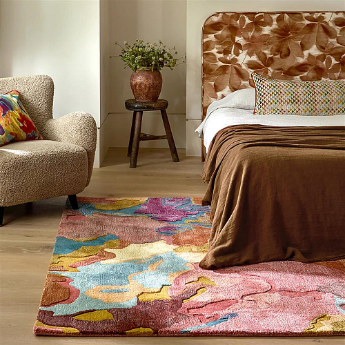
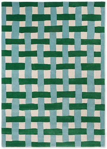
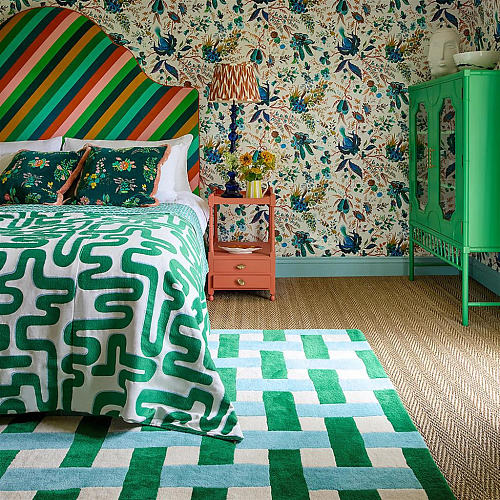
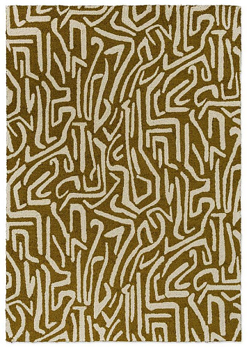
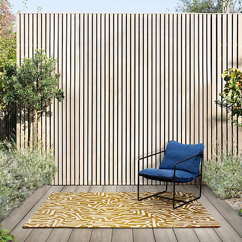
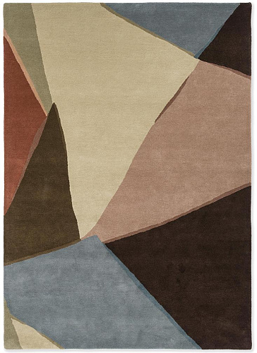
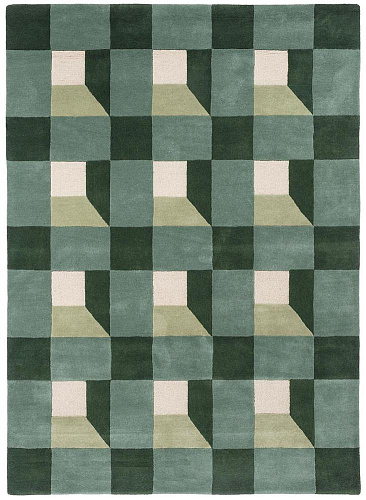
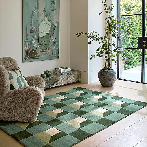
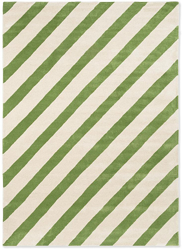
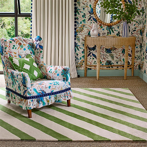
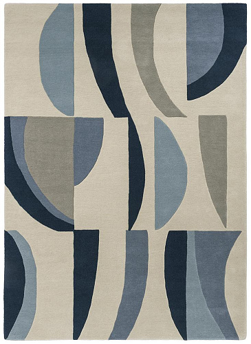
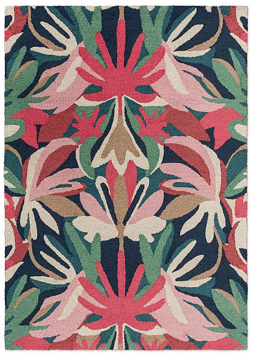
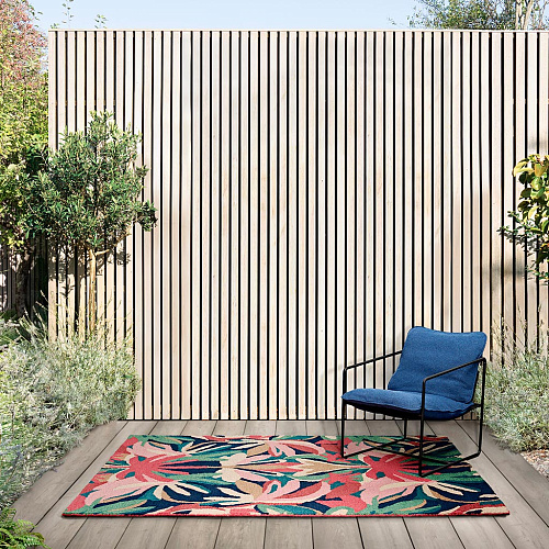
The rug collections span a wide tonal and structural range. The Anthology series takes an abstract approach — layered texture, tonal depth, surfaces that change character depending on the light direction. Zeal and Momentum lean into geometric structure with sharp contrast and a more graphic visual language. Salinas draws on natural and organic references — the textures of coastlines and eroded surfaces — with a softer, more irregular palette. Pebble Shore and Kaleidoscope explore what happens when pattern operates at the level of texture rather than motif.
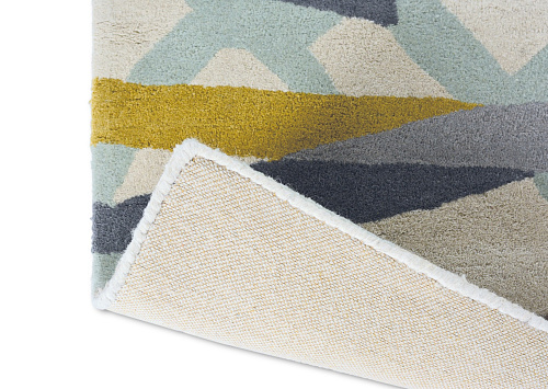
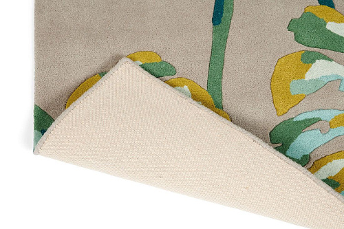
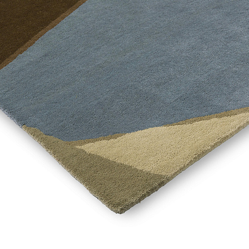
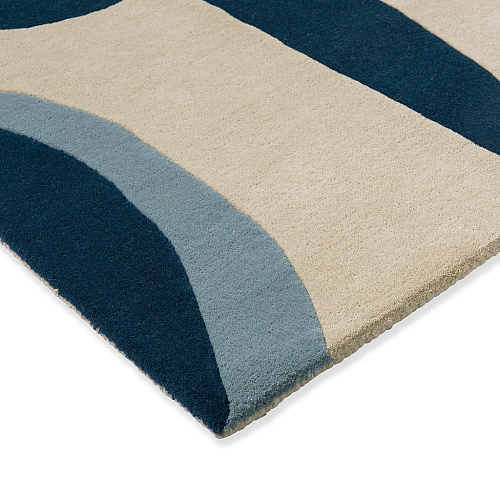
Construction is hand-tufted throughout, in pure new wool. Pile weight and density are consistent with rugs designed for domestic use over years rather than for showroom display. The colour accuracy in the finished pieces — the way the woven surface matches the design intent — reflects the care Brink & Campman take in yarn selection and manufacturing process, which is the part of rug production most brands are least transparent about.
For interiors built around a specific colour story, Harlequin is one of the more reliable places to start — the palette range is genuine, the design thinking behind it is traceable, and the physical quality supports the visual ambition.